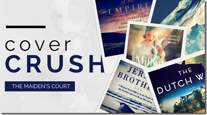
We can all say that you should never judge a book by its cover, but I guarantee that we all have done so at least once! Cover Crush is designed to feature some of those covers that have caught the eye as a standout on the bookshelf.
The first thing that catches my attention is the color palette. The black, white, and golds are very different than the majority of historical fiction covers that we see lately, which as I have pointed out in several posts are frequently in jewel tones. I also love how we see half her face – hey, at least it’s not a headless woman and she is looking straight out at the viewer! Lovely.
What are your thoughts on this cover?
I wonder what my friends are crushing on this week? Let’s check it out: 2 Kids and Tired Books; Flashlight Commentary; A Bookaholic Swede; Layered Pages; A Literary Vacation


No comments:
Post a Comment
Thanks for leaving your comments! I love reading them and try to reply to all!