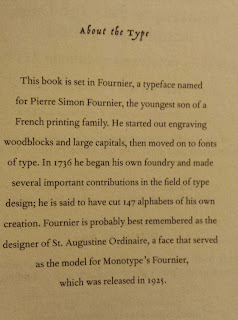
 |
| From The Queen's Vow by C.W. Gortner |
You don’t come across them often, and probably even less so with the advent of e-books and the fact that you can change the font in which you read in, but there it is none the less! Many people might not even notice this section as they stop reading at the end of the story, but I always read the back matter: the author’s note, skim through and further reading suggestions, the bio of the author, and then there is what is known as the colophon – or the information about the font the work is printed in. I have always viewed this as just an interesting tidbit – and honestly I don’t really notice the differences between the fonts used to print a book, but I knew there must be something behind this seemingly random inclusion.
Here is what I found out:
- As mentioned above, the section is called the Colophon. It used to include much of the information that we now expect to see in the title page, such as the publication information.
- Typically these days we will see a colophon used to explain the font type used for the printing and a little back history
- According to Wikipedia, these publishers most frequently use the colophon: Alfred A. Knopf, Folio Society, and O’Reilly Media.
I have went through a bunch of the books on my shelf and have found three books containing a note about the font (2 in Fournier and 1 in Garamond) – and all three were printed by Ballantine Books.
 |
| From The Last Queen by C.W. Gortner |

Copyright © 2016 by The Maiden’s Court


I have seen these but never knew there is a word for it! Usually, it seems, I find them in books where they font was purposely chosen to convey a specific mood or idea. I'll have to watch for them now!
ReplyDeleteI eventually went and googled something like "history of font at the end of a book" and bingo!
Delete